Raising The Roof /\ A Kitchen Story
The kitchen! The undeniable hub of the home and especially important to our family as we love to cook and entertain. An incredible kitchen was top of our list when we were house hunting but we found that most of the newer/remodeled kitchens we toured were not our taste or the choices we would have made if doing it ourselves. When we found this house we loved so many things about it, but the kitchen was not one of them! We knew that it would be one of our first major projects and we broke ground on the renovation 6 months into living in the house.
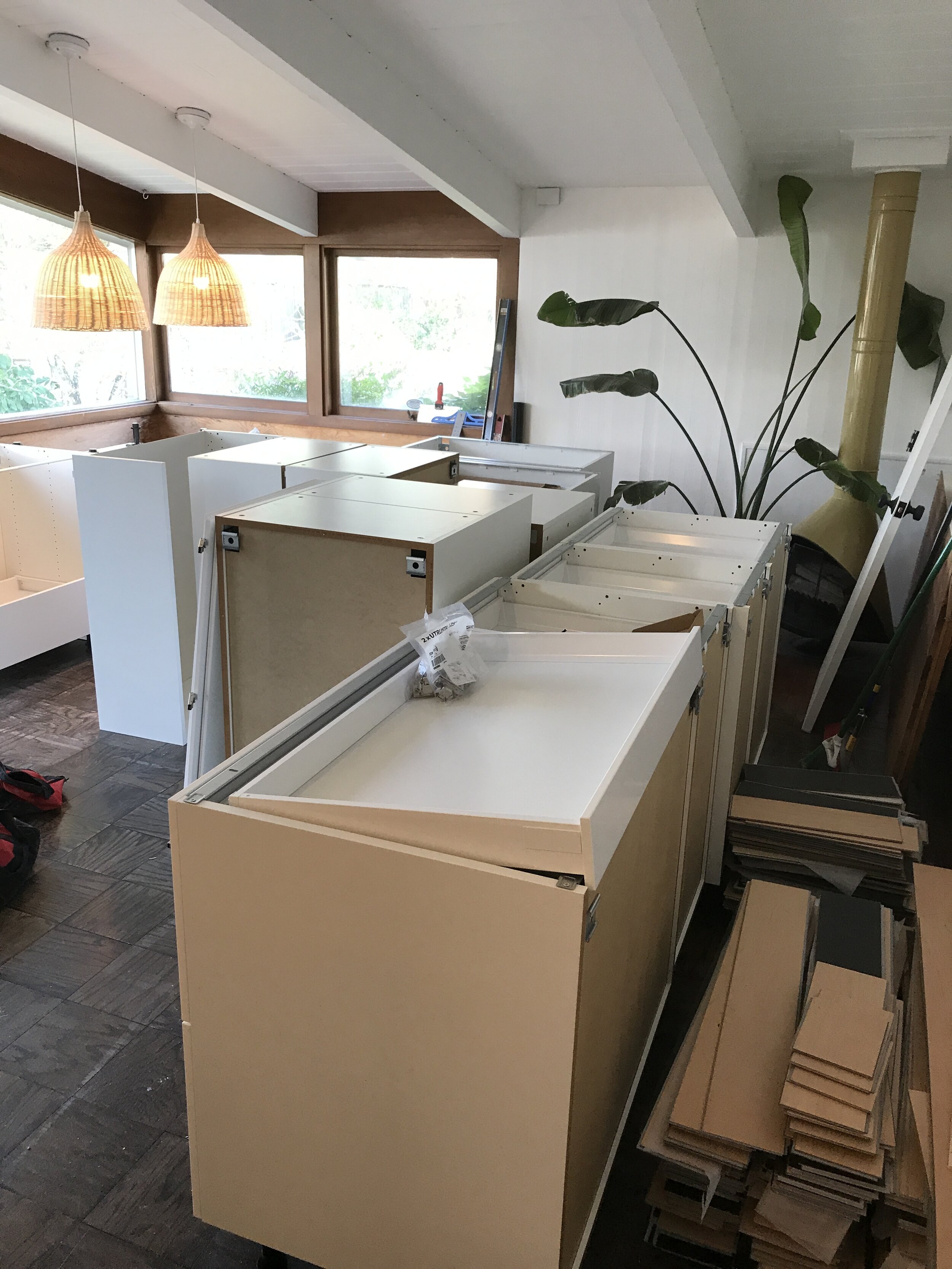
Let’s talk about where we started. The kitchen was dark and cramped with low ceilings, soffits, one small window, and terrible track lighting. The cabinets were wood veneer and had been painted in a two tone color scheme on the outside only. I am pretty certain they weren’t even removed when they were painted, the hinges were painted and the insides were left unpainted but paint had dripped through. The lower cabinets had wooden drawers that were impossible to open and shut without significant muscling. On the opposite wall was the weirdest floating drawer unit that was deeper than standard cabinet depth, and low enough to be a crazy hazard for toddlers. Above that, a glass front cabinet that was also completely impractical. These were painted yet another color. The appliances were original, only one burner on the stove worked and the oven was tiny. The flooring was linoleum and did not match any of the 4 other types of flooring on the main level of the house (we have since installed maple flooring throughout and I will dedicate a full post to that adventure). The footprint of the space was actually a decent size but it felt so small. We didn’t want to take walls down in the kitchen because our floorplan is already rather open and flow wise it just didn’t make sense. It is so wild to look back at these before pictures.
Pregnant belly reflection in the original General Electric oven!
When it came time to design our the kitchen project we had a few main objectives.
Modernize and aesthetically upgrade everything
Convert from electric to gas cooktop
Create tons of storage
Create lots of usable counterspace
Update all of the appliances
Make the window larger to let in more light
Re-orient the space to make it more functional
We spent months working and re-working the layout and design of the kitchen to make the most of the footprint. Design wise, we wanted the space to feel bright, warm and Scandinavian, with a mid-century nod, essentially the same approach as the rest of our house. Layout wise, we decided to move the fridge to the other side of the room to open up the space and create more room for pantry storage and to go with a range instead of the separate cooktop and oven we previously had. As we were working through the plans there was one thing we just couldn’t get off our minds. The rest of the main level of our house has vaulted ceilings with exposed tongue and groove board but the kitchen had its drop ceiling. We couldn’t help wonder if the same ceilings existed underneath. We were able to access a crawl space through our upstairs linen closet and sure enough, incredible 60 year old tongue and groove ceilings were hidden away and surrounded in clouds of pink insulation material. We learned that many homes of this era dropped ceilings to provide more insulation and save on heating costs, but it felt like such a miss., Once we knew that ceiling was up there we couldn’t let it go and we decided we would open up the space.
We handled the majority of the demo ourselves and it was pretty straightforward. We tore out the cabinets, old appliances and flooring and the room was pretty much gutted. Ultimately we brought the kitchen down to the studs and that was the most exciting and stressful feeling. We called in the professionals to demo the ceiling and remove and dispose of the insulation, luckily we didn’t have asbestos but that stuff was still gnarly. We had a hunch that the majority of our home’s electrical routed through the old kitchen ceiling and this was confirmed during demo so we had to fork over a chunk of change to re-route all of the electrical. This is something we anticipated and planned for and even though it is not a fun way to spend money it paid off because the new ceiling height makes the kitchen feel huge and gave the space a whole new life.
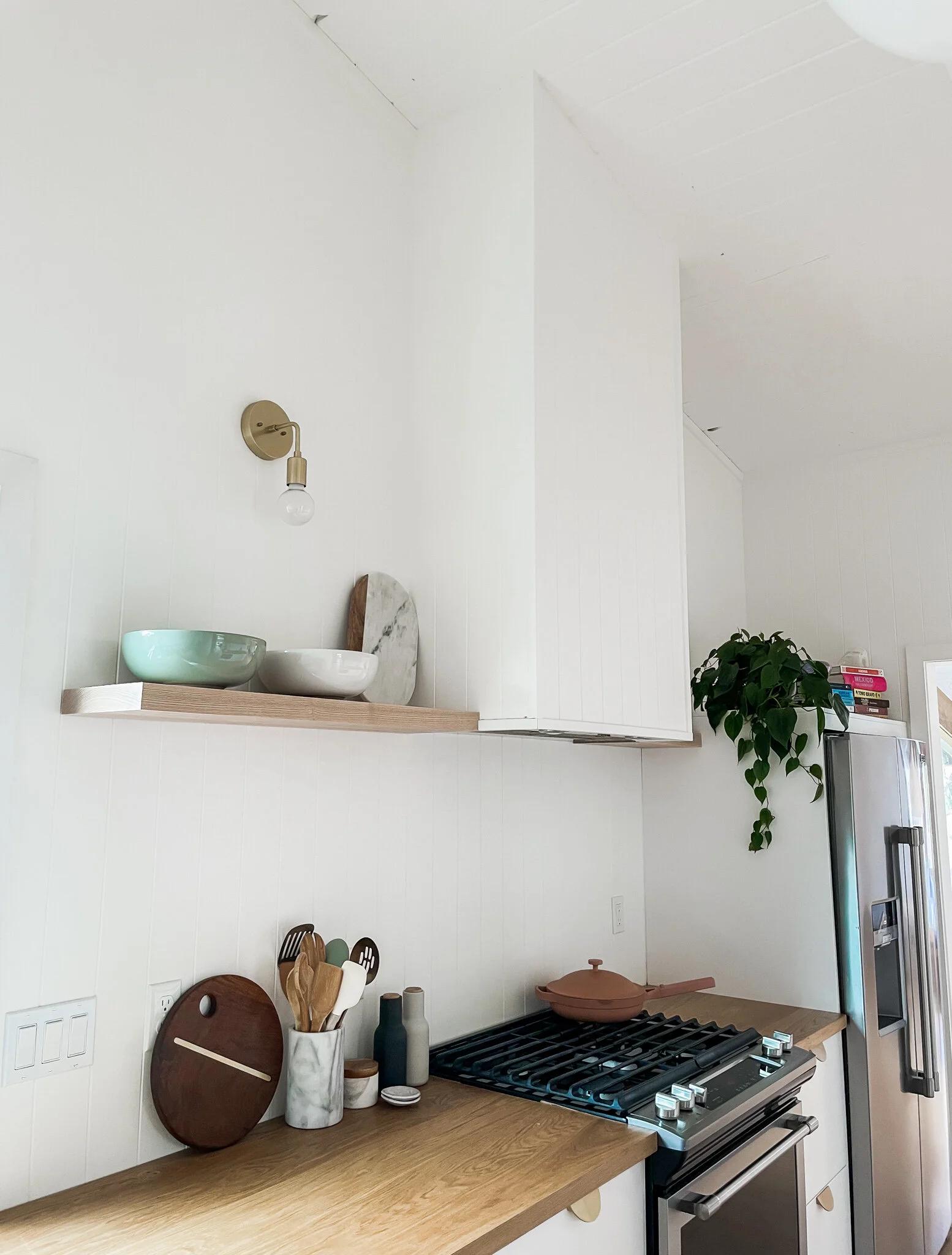
We decided to go with paneling instead of drywall for the kitchen walls and we used it from countertop to ceiling. The panels come in 4’x8’ sheets and once caulked and painted the seams are concealed. With the window behind the sink now at countertop height we didn’t need a backsplash there and we have discussed adding a stone or tile backsplash behind the stovetop but splashing has not been an issue and we like the clean look of the paneling for now, but could be a fun project to add something new later on. We also wrapped our hood vent in the paneling and trimmed out the edges.
Once we got the tongue and groove exposed and cleaned up we had to make a decision around how to treat it. We knew we wanted to match the existing T&G ceilings but that was a bit tricky. Our living room has white washed tongue and groove which we love but it has been aging for 60 years and we weren’t sure how we would successfully replicate the treatment. Our dining room which is adjacent to the kitchen has white painted tongue and groove ceilings. The wood in the kitchen wasn’t in the best shape and with our workback schedule we didn’t really have time to test different methods, so we decided to paint the ceilings white to be consistent with the dining room. We knew we were bringing in natural wood tones with other elements so we felt ok with this decision in the end.
For cabinetry we decided to go the stock route, opting for the very popular Ikea Sektion system. There were a few factors that contributed to our decision to go stock vs custom on the cabinetry. This decision is so specific to your home and your goals for your space but here was our thought process: First off, budget, in general your dollar stretches much farther with stock than custom. We are trying to be super considerate around where we spend and where we save on this home. This based off the fact that we are renovating it top to bottom in a short timespan and also because we want to be wise around our level of investment and to ensure it is appropriate for our specific home. Second, we knew that look wise we wanted white, flat front cabinets and to bring in some style with the hardware, so something simple did the trick for us. Lastly, we had a decent amount of flexibility with layout because we were gutting the kitchen so we were able to make stock sizes work in our space. Wow, who knew I could talk so long about kitchen cabinets, is this what adulting looks like? The Ikea cabinets turned out to be a perfect choice for us. We went with drawers for our lowers and added a row of uppers for dishes, glassware, mugs and pantry items. The drawers offer so much storage it is wild. We have been so impressed with the amount of storage the drawers provide and the hidden drawers allow you to take full advantage of the drawer space. This was 100% the right choice for our home.
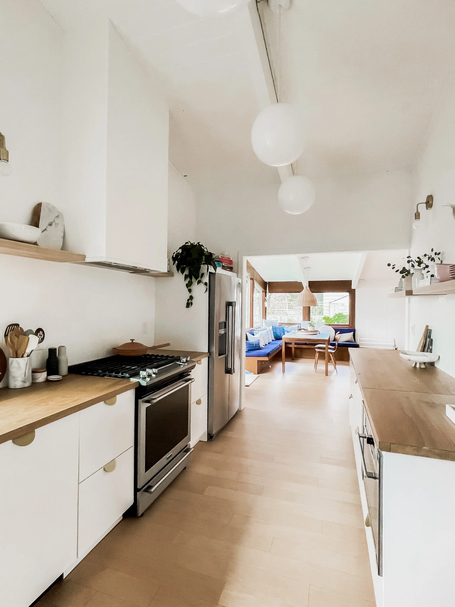
Once the cabinetry was installed things started to come together quickly. We laid our flooring which is the same Maple engineered hardwood we have used throughout our house - Shaw Floor’s SmartCore Naturals Maple Bluegrass Trail. Our appliances are Maytag, no frills but we appreciated the simplicity and classic look and we added a gas line so we could go with a gas range. Our dishwasher has a panel front so it blends with the cabinetry, and we went with a large stainless under-mount sink and matte black faucet. We used brass bin pulls from CB2 on the drawers, brass knobs from CB2 beneath the sink and left the uppers hardware free. Three white globe pendants were installed down the center of the room with brass globe sconces along the side walls. We found beautiful Ash wood at Crosscuts here in Portland and installed open shelving along the side walls for serving pieces.
Overall we are so happy with how the space came together. It feels like it has doubled in size, it is so functional, we have more counter space than we could ever need, and there is just a feeling of ease making meals in this space. It now feels like a seamless extension of the rest of our home.
Les Petites Room
How are our girls almost 2?! My babies have become toddlers before my very eyes!
We moved into our home when the twins were 12 days old so our nursery was very sweet but pretty minimal. A fresh coat of white paint, cribs, glider and the changing table was pretty much all we needed to survive the early days of twin parenthood. Now that the girls are pushing two we wanted to re-arrange the room to take better advantage of the space and to create more room for play, drawing and reading. We wanted to incorporate a bit of color but keep it soothing and soft. I was inspired by a few shades of terracotta from their crib sheets and some of their existing decor. This shade is Soft Cranberry by Benjamin Moore in satin, we customized the mix at 70% saturation and used their Natura line which is VOC free.
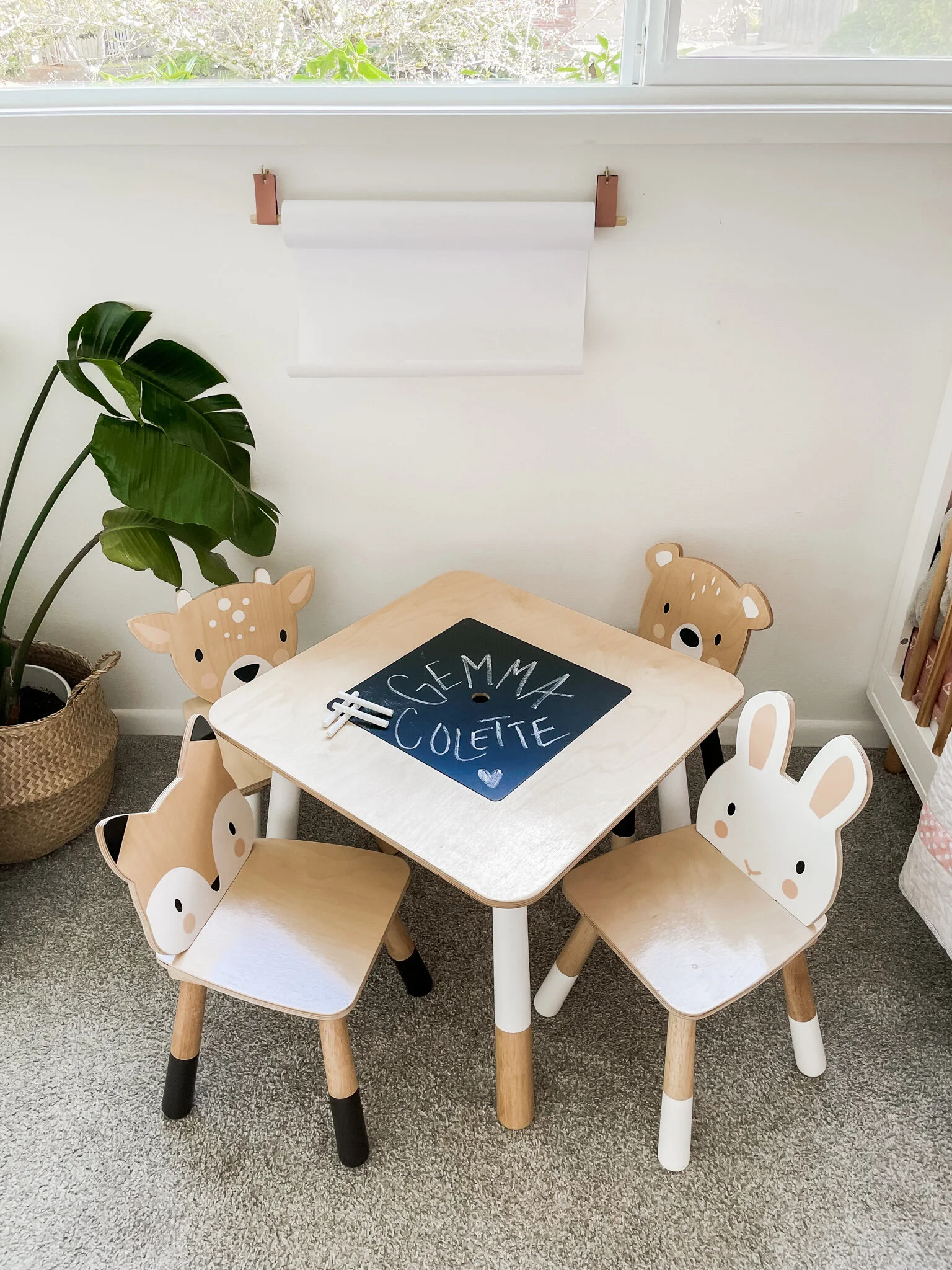
Otherwise we kept the room pretty tonal with lots of white, light woods, woven rattan, layered sheepskins, and just a touch of brass. My mom made the girls these quilts and they are so precious and will be so special for them to have their whole lives. We have loved these cribs and they will eventually convert into toddler beds. This sweet table has a chalkboard top and a hidden storage compartment for chalk and crayons. I made a simple paper roll with a dowel (repurposed from an old baby gate), some scrap leather that I painted to match the wall and a couple of screw in wall hooks.
Sources:
1. Cribs 2. Dresser 3. Wood Knobs 4. Glider 5. Crib Sheets 6. Shelves 7. Table & Chairs 8. Mobiles 9. Lamp 10. Pendant Light
Bath Time
It all begins with an idea.
This bathroom was a bit of a head scratcher. It was partially original to our 1962 Mid-Century modern house, and was partially updated in the 80’s or 90's, where linoleum flooring, floral shower tile, and tub insert were added to the picture. Overall it was dated, aesthetically mis-matched and lacked storage.
This is our primary bathroom so we need to better maximize the space and we needed to modern and freshen the overall feel. We had a few main goals for this space: 1. Cosmetic Updates 2. Try to squeeze in a double vanity to make the bathroom more functional 3. Add storage 4. Do it all ourselves 5. Keep it economical! This bathroom upgrade ran us $2200 all in.
Time for the before photos! I will admit I forgot to document the before, these photos are from the original house listing and from the day we toured the house.
The footprint of this bathroom does not take advantage of the overall square footage, and we looked at re-working the space, but ultimately decided that budget and effort wise it made sense to leave the footprint as is and focus on maximizing and modernizing.
First step, demo of course! Knock on wood, this demo went off without a hitch. Pulled out the vanity, backsplash, mirrors, wall mounted medicine cabinet, sink, toilet, inset toilet paper dispenser, and linoleum flooring with no major issues.
We went into the remodel not really knowing what our plan was for the tub/shower. The tub was beige, stained and grimy and needed to be replaced, but were weren’t sure what we could achieve ourselves and what we might hire out. As we started demo-ing we realized that the tub actually had a liner covering the original porcelain tub. We removed the liner and realized the original tub was an original 60’s shape and it seemed to be in good condition beneath the liner adhesive.
We put a ton of elbow grease into cleaning it up and realized we could definitely bring it back to life. Our process involved LOTS of cleaning products, Goo Gone, rubbing alcohol and Mr. Clean Magic Erasers and the result is pretty incredible. Restoring the original tub was such an unexpected surprise. We updated the fixtures and left the tile as is for now, eventually we plan to update the tile and add glass door.
For flooring we stuck with the Maple Smartcore Naturals engineered hardwood flooring that we used throughout the house. The flooring is 100% waterproof so we didn’t have any concerns using it in the bathroom and really wanted the seamless look of the hallway flooring to continue into the bathroom. Plus, Jeff has become a pro at installing it himself.
Next up, the vanity. We opted for an Ikea Godmorgon sink cabinet which is super affordable and comes in a variety of sizes. The wall behind our toilet pops out to allow room for the plumbing and in order to fit a double sink vanity size we needed to cut into that wall a bit. We rebuilt the new wall with drywall but instead of worrying about texturizing the new wall and the area where we demoed the original backsplash we opted to cover the wall in sheet paneling. This added warmth and character and was also less labor intensive. The paneling is easy to install and we just caulked the edges, added corner moulding, and gave it all a fresh coat of paint.
After a few projects under our belt we are now acquiring some amateur plumbing skills and were able to split the sink line ourselves to account for the additional sink as well as swap in the new toilet. Hot tip, if replacing your toilet check to see if your city offers a water efficiency rebate, most do if you purchase a WaterSense labeled model. Our rebate was simple to apply for, just mail in a form and get a $75 rebate on your water bill.
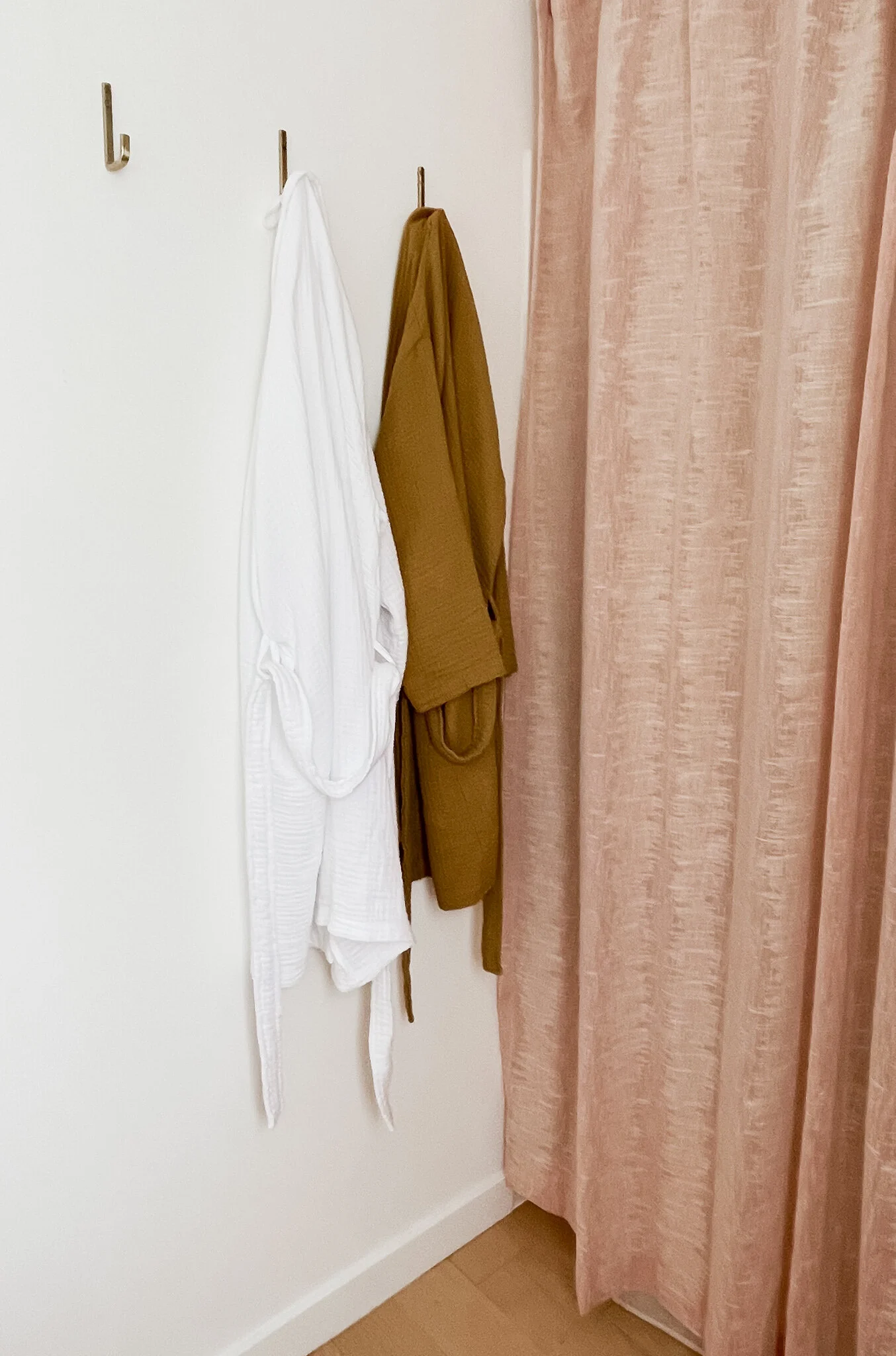
We used the Ikea porcelain double sink countertop on the vanity and selected these simple faucets. Our original plan was to go all brass all day but it felt a little bit over the top so we decided to balance it out with a combination of brass and black hardware and fixtures. We kept the drawer pulls, mirror, light fixtures and robe hooks brass and swapped in matte black faucets, a black towel ring and rack, black TP dispenser and black accents and we feel it toned it down and kept it feeling neutral and clean.
We loved this arc shaped mirror, it adds softness and interest to the plain vanity, and echoes the shape of the drawer pulls. I have been wanting to use this wall sconce from Cedar and Moss for something and this felt like a good combo!
That’s about it! This gave our bathroom a totally fresh look and feel and only took about a week. By handling all of the labor ourselves and taking a moderate approach with our design choices we were able to keep this update affordable but also high impact.
The Dining Nook
It all begins with an idea.
The dining nook might be the space that made me fall in love with this house.
This felt like the heart of the home, a built in space for gathering, eating and being together with people we love. Less of that has happened since we’ve been in this house (thanks, Covid) but we know more of those times are just around the corner.
The backstory of this room is that it was a deck when the house was built in 1962 and was enclosed to become a sunproch a year later in 1963. As a result, this room features original exterior cedar siding which creates some unique wall paneling and this amazing avocado Preway wood stove was installed as a heat source.
I had so many questions about this space. Why was one wall left natural cedar and the other painted white? What is the deal with these bulky blind casings that hide the full shape of the windows? Did we need this white metal sheeting behind the wood stove? Why did they opt for cheap faux parquet flooring in here that doesn’t match anything else in the house? And why oh why oh WHY are the pendants not aligned over the dining area? We got after this room in phases and tried to address those question marks in a thoughtful way.
We started by creating a blank slate. We pulled down the metal shelving and painted the cedar wall to the right of the dining area white. Painting wood is a tough decision, there were a few factors we considered here, but our biggest issue was that the transition between the wood wall and the white wall behind the Preway woodstove was not a clean look and didn’t highlight the fireplace. We also weren’t sure if it would be possible to remove the white heat barrier behind the fireplace and figured it would blend better on a white wall. After looking into codes it turned out that we did not need it so we removed it later on, but at the time it was a factor in the decision making. We consider the woodstove to be the focal point of the room and wanted it to shine. We figured by retaining the natural wood tones around the dining area we could maintain the contrast but still clean up that corner.
We removed the parquet and the terracotta tiles around the fireplace and carried in Maple engineered hardwood that Jeff and his dad installed throughout most of our home. I will dedicate an entire post to our adventure in flooring, but we love this Maple so much and saved major $$$ doing it ourselves. I love how much the floors brighten this space and they are so durable with pets and kids.
We removed the funky blind casings as well as the blinds and refinished the wood window frames. We also cleaned and caulked the tongue and groove ceiling and gave it a fresh coat of paint, this took forever (my father-in-law is a saint) but it made a huge difference on the tired ceiling.
For the lighting, we knew for sure that we wanted to reorient the lights to be centered over the dining table. Sadly, the original pendants were in rough shape, stained and torn, so we removed them and replaced them with rattan basket pendants that added neutrality and lightness to the space. Installing light fixtures on tongue and groove ceilings is a complicated process when there is no attic, the cable has to be exposed. We ran the wire on the backside of the beam so that it is concealed and somehow Jeff and his friend made it all happen without calling an electrician, so that was a win.
Finally, we addressed the seating area. I can totally imagine the bright yellow vinyl cushions in their heyday, but they were definitely past their prime. Upon inspection the foam was still in good enough shape and although they weren’t looking so hot, the vinyl and zippers were decently sturdy. Custom cut foam can be super pricey, so we decided to just cover these with a heavy linen upholstery fabric in a dark blue. My very talented mother sewed the new covers for us and they are super easy to remove and toss in the wash, plus it is nice to have the waterproof vinyl underneath in case of spills.
We added lots of throw pillows and we already had this marble and walnut dining table which fit the space perfectly, along with these Cherner chairs which were passed down from my grandparents. This is a pretty perfect loungey nook and toddler climbing gym. We love this space so much and live in it so hard.
How It Started vs. How It’s Going
Figured the best place to start is at the very beginning.
It was April of 2019 and I was 6 months pregnant with spontaneous twin girls. Let’s really underscore the word spontaneous and emphasize how unprepared we were to bring not one but two babies into the world. At the time I was working in a job that involved four months of travel a year, and my husband, Jeff, was using the second bedroom of our two bedroom apartment as his home music studio.
We had actually been in the market for a home on and off since 2015, but we were admittedly extremely picky, we were playing in a very competitive housing market in Portland, Oregon, and we were in no real rush. We dreamed of finding a mid-century modern ranch with all of the touchstones of 1960’s architecture; tongue and groove vaulted ceilings, beam and post lines, a cool floorplan, a fireplace, etc, and we were holding out for the right one. We had made multiple offers over the years and had a few tough losses, but we never felt truly in love with any one house.
When we became pregnant we started getting serious about the hunt. At that point, although we loved the idea of remodeling a house and putting our own mark on it, we felt like our circumstances meant we needed to find something relatively turnkey. In our price range we saw so many homes that needed new kitchens, new bathrooms, etc, and it felt so overwhelming. We also saw tons of recent remodels that looked like flips and it pained us to think we were paying for renovations that were not to our taste. Six months later we were desperate, stressed and felt like we were going to be making a big compromise.
But finally, it happened. I will never forget the moment the listing popped up. I was laying on the couch like a beached whale, taking part in my nightly routine of obsessively refreshing my Redfin feed, when I saw the promising exterior photo. I took a deep breath as I began scrolling through the images, and immediately my heart started racing. This house had so much going for it and was a goldmine of potential. Vaulted T&G ceilings? Three fireplaces?! The dining nook! A crazy split level situation?! So many period details that we love. And it met all of our functional criteria, as well; Three bedrooms, two bathrooms, a garage and driveway, a great yard and a basement for Jeff’s studio.
It was not the turnkey house we originally set out to find, it was better. The house was cool to begin with, but the vision for where we could take it started to come together before I had even texted the listing to Jeff (don’t judge, he was in the other room and I was the aforementioned whale) and by the end of the weekend it was ours! Although I have always had a passion for interior design and we are both pretty handy, we did not have any actual experience with home renovations. This home lit a fire in us, that has now become a passion/obsession and has led to endless scope creep as one project inspires the next.
Here’s how it started and I’m looking forward to sharing how it’s going.


