Bath Time
This bathroom was a bit of a head scratcher. It was partially original to our 1962 Mid-Century modern house, and was partially updated in the 80’s or 90's, where linoleum flooring, floral shower tile, and tub insert were added to the picture. Overall it was dated, aesthetically mis-matched and lacked storage.
This is our primary bathroom so we need to better maximize the space and we needed to modern and freshen the overall feel. We had a few main goals for this space: 1. Cosmetic Updates 2. Try to squeeze in a double vanity to make the bathroom more functional 3. Add storage 4. Do it all ourselves 5. Keep it economical! This bathroom upgrade ran us $2200 all in.
Time for the before photos! I will admit I forgot to document the before, these photos are from the original house listing and from the day we toured the house.
The footprint of this bathroom does not take advantage of the overall square footage, and we looked at re-working the space, but ultimately decided that budget and effort wise it made sense to leave the footprint as is and focus on maximizing and modernizing.
First step, demo of course! Knock on wood, this demo went off without a hitch. Pulled out the vanity, backsplash, mirrors, wall mounted medicine cabinet, sink, toilet, inset toilet paper dispenser, and linoleum flooring with no major issues.
We went into the remodel not really knowing what our plan was for the tub/shower. The tub was beige, stained and grimy and needed to be replaced, but were weren’t sure what we could achieve ourselves and what we might hire out. As we started demo-ing we realized that the tub actually had a liner covering the original porcelain tub. We removed the liner and realized the original tub was an original 60’s shape and it seemed to be in good condition beneath the liner adhesive.
We put a ton of elbow grease into cleaning it up and realized we could definitely bring it back to life. Our process involved LOTS of cleaning products, Goo Gone, rubbing alcohol and Mr. Clean Magic Erasers and the result is pretty incredible. Restoring the original tub was such an unexpected surprise. We updated the fixtures and left the tile as is for now, eventually we plan to update the tile and add glass door.
For flooring we stuck with the Maple Smartcore Naturals engineered hardwood flooring that we used throughout the house. The flooring is 100% waterproof so we didn’t have any concerns using it in the bathroom and really wanted the seamless look of the hallway flooring to continue into the bathroom. Plus, Jeff has become a pro at installing it himself.
Next up, the vanity. We opted for an Ikea Godmorgon sink cabinet which is super affordable and comes in a variety of sizes. The wall behind our toilet pops out to allow room for the plumbing and in order to fit a double sink vanity size we needed to cut into that wall a bit. We rebuilt the new wall with drywall but instead of worrying about texturizing the new wall and the area where we demoed the original backsplash we opted to cover the wall in sheet paneling. This added warmth and character and was also less labor intensive. The paneling is easy to install and we just caulked the edges, added corner moulding, and gave it all a fresh coat of paint.
After a few projects under our belt we are now acquiring some amateur plumbing skills and were able to split the sink line ourselves to account for the additional sink as well as swap in the new toilet. Hot tip, if replacing your toilet check to see if your city offers a water efficiency rebate, most do if you purchase a WaterSense labeled model. Our rebate was simple to apply for, just mail in a form and get a $75 rebate on your water bill.
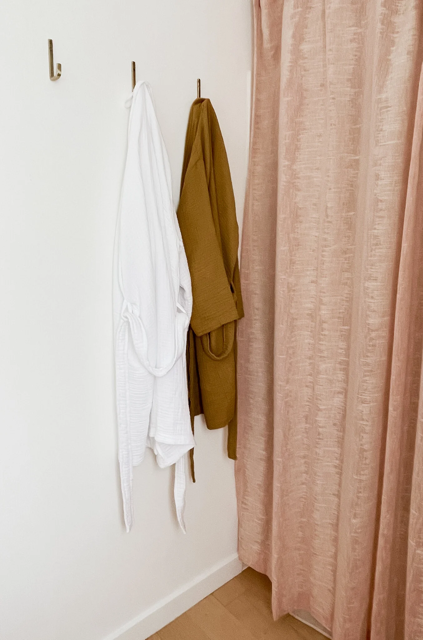
We used the Ikea porcelain double sink countertop on the vanity and selected these simple faucets. Our original plan was to go all brass all day but it felt a little bit over the top so we decided to balance it out with a combination of brass and black hardware and fixtures. We kept the drawer pulls, mirror, light fixtures and robe hooks brass and swapped in matte black faucets, a black towel ring and rack, black TP dispenser and black accents and we feel it toned it down and kept it feeling neutral and clean.
We loved this arc shaped mirror, it adds softness and interest to the plain vanity, and echoes the shape of the drawer pulls. I have been wanting to use this wall sconce from Cedar and Moss for something and this felt like a good combo!
That’s about it! This gave our bathroom a totally fresh look and feel and only took about a week. By handling all of the labor ourselves and taking a moderate approach with our design choices we were able to keep this update affordable but also high impact.


