Raising The Roof /\ A Kitchen Story
The kitchen! The undeniable hub of the home and especially important to our family as we love to cook and entertain. An incredible kitchen was top of our list when we were house hunting but we found that most of the newer/remodeled kitchens we toured were not our taste or the choices we would have made if doing it ourselves. When we found this house we loved so many things about it, but the kitchen was not one of them! We knew that it would be one of our first major projects and we broke ground on the renovation 6 months into living in the house.
Let’s talk about where we started. The kitchen was dark and cramped with low ceilings, soffits, one small window, and terrible track lighting. The cabinets were wood veneer and had been painted in a two tone color scheme on the outside only. I am pretty certain they weren’t even removed when they were painted, the hinges were painted and the insides were left unpainted but paint had dripped through. The lower cabinets had wooden drawers that were impossible to open and shut without significant muscling. On the opposite wall was the weirdest floating drawer unit that was deeper than standard cabinet depth, and low enough to be a crazy hazard for toddlers. Above that, a glass front cabinet that was also completely impractical. These were painted yet another color. The appliances were original, only one burner on the stove worked and the oven was tiny. The flooring was linoleum and did not match any of the 4 other types of flooring on the main level of the house (we have since installed maple flooring throughout and I will dedicate a full post to that adventure). The footprint of the space was actually a decent size but it felt so small. We didn’t want to take walls down in the kitchen because our floorplan is already rather open and flow wise it just didn’t make sense. It is so wild to look back at these before pictures.
Pregnant belly reflection in the original General Electric oven!
When it came time to design our the kitchen project we had a few main objectives.
Modernize and aesthetically upgrade everything
Convert from electric to gas cooktop
Create tons of storage
Create lots of usable counterspace
Update all of the appliances
Make the window larger to let in more light
Re-orient the space to make it more functional
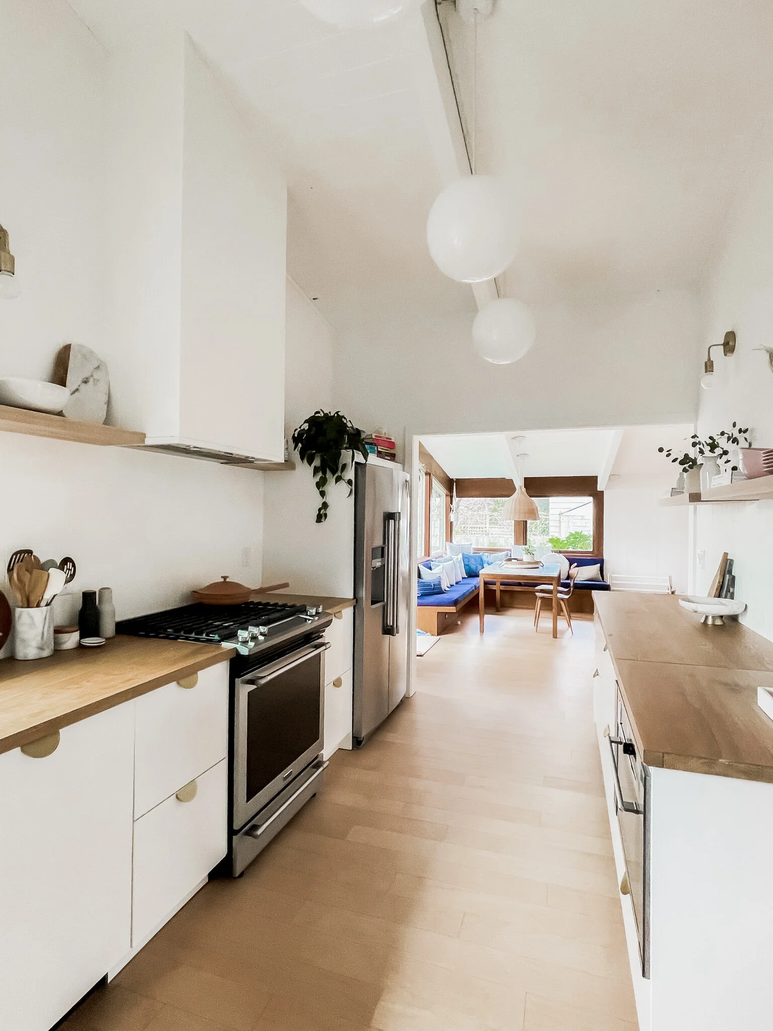
We spent months working and re-working the layout and design of the kitchen to make the most of the footprint. Design wise, we wanted the space to feel bright, warm and Scandinavian, with a mid-century nod, essentially the same approach as the rest of our house. Layout wise, we decided to move the fridge to the other side of the room to open up the space and create more room for pantry storage and to go with a range instead of the separate cooktop and oven we previously had. As we were working through the plans there was one thing we just couldn’t get off our minds. The rest of the main level of our house has vaulted ceilings with exposed tongue and groove board but the kitchen had its drop ceiling. We couldn’t help wonder if the same ceilings existed underneath. We were able to access a crawl space through our upstairs linen closet and sure enough, incredible 60 year old tongue and groove ceilings were hidden away and surrounded in clouds of pink insulation material. We learned that many homes of this era dropped ceilings to provide more insulation and save on heating costs, but it felt like such a miss., Once we knew that ceiling was up there we couldn’t let it go and we decided we would open up the space.
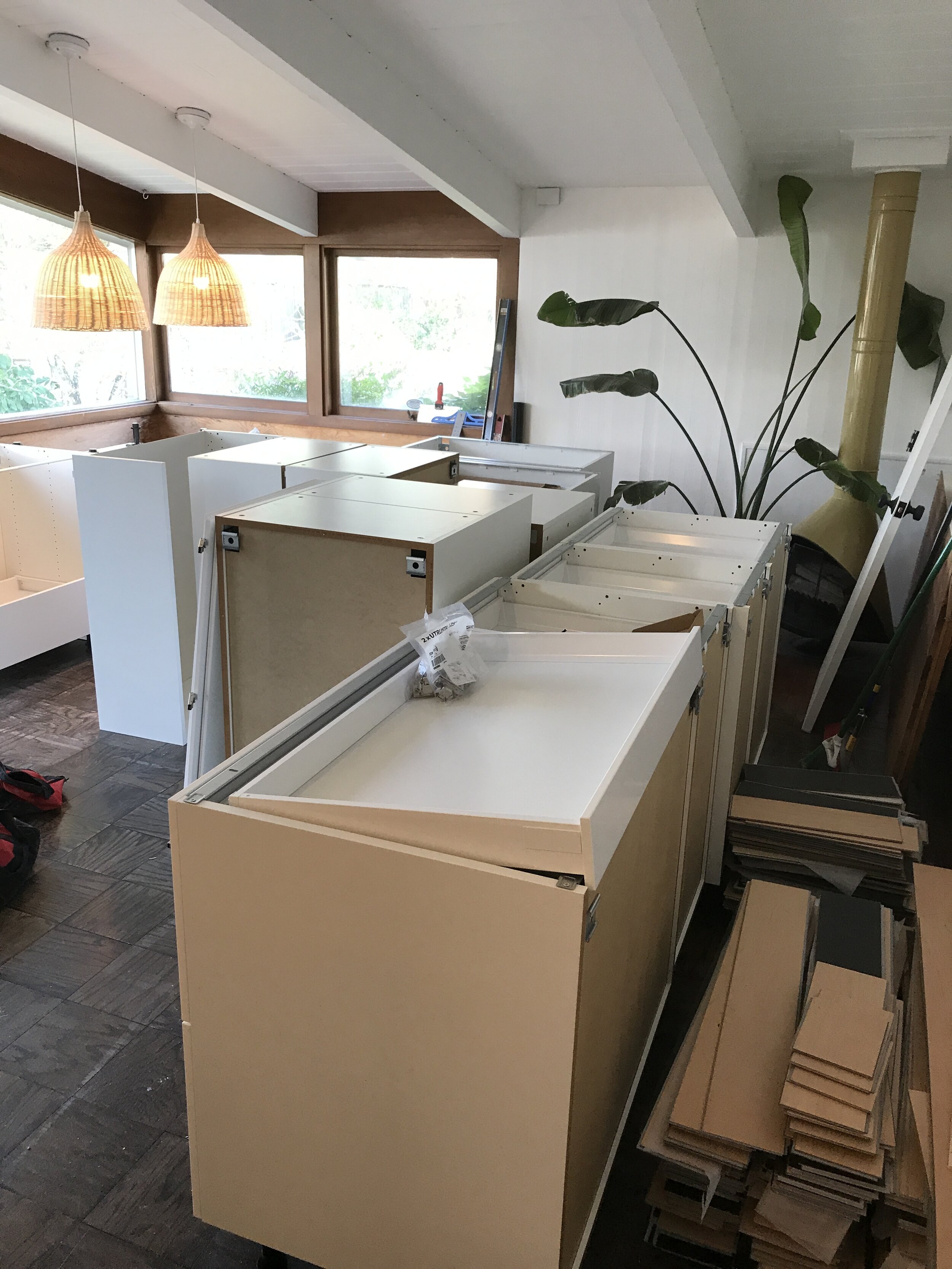
We handled the majority of the demo ourselves and it was pretty straightforward. We tore out the cabinets, old appliances and flooring and the room was pretty much gutted. Ultimately we brought the kitchen down to the studs and that was the most exciting and stressful feeling. We called in the professionals to demo the ceiling and remove and dispose of the insulation, luckily we didn’t have asbestos but that stuff was still gnarly. We had a hunch that the majority of our home’s electrical routed through the old kitchen ceiling and this was confirmed during demo so we had to fork over a chunk of change to re-route all of the electrical. This is something we anticipated and planned for and even though it is not a fun way to spend money it paid off because the new ceiling height makes the kitchen feel huge and gave the space a whole new life.
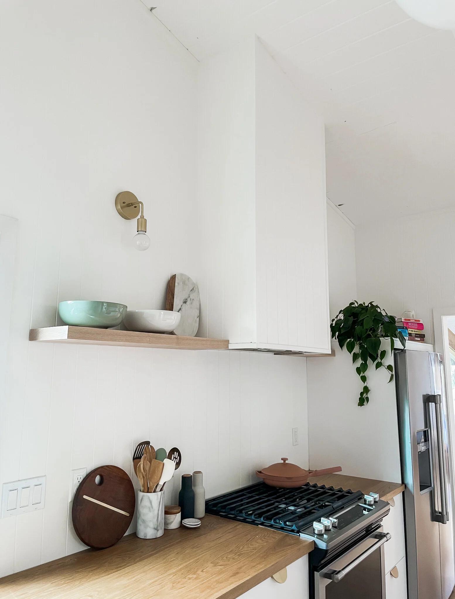
We decided to go with paneling instead of drywall for the kitchen walls and we used it from countertop to ceiling. The panels come in 4’x8’ sheets and once caulked and painted the seams are concealed. With the window behind the sink now at countertop height we didn’t need a backsplash there and we have discussed adding a stone or tile backsplash behind the stovetop but splashing has not been an issue and we like the clean look of the paneling for now, but could be a fun project to add something new later on. We also wrapped our hood vent in the paneling and trimmed out the edges.
Once we got the tongue and groove exposed and cleaned up we had to make a decision around how to treat it. We knew we wanted to match the existing T&G ceilings but that was a bit tricky. Our living room has white washed tongue and groove which we love but it has been aging for 60 years and we weren’t sure how we would successfully replicate the treatment. Our dining room which is adjacent to the kitchen has white painted tongue and groove ceilings. The wood in the kitchen wasn’t in the best shape and with our workback schedule we didn’t really have time to test different methods, so we decided to paint the ceilings white to be consistent with the dining room. We knew we were bringing in natural wood tones with other elements so we felt ok with this decision in the end.
For cabinetry we decided to go the stock route, opting for the very popular Ikea Sektion system. There were a few factors that contributed to our decision to go stock vs custom on the cabinetry. This decision is so specific to your home and your goals for your space but here was our thought process: First off, budget, in general your dollar stretches much farther with stock than custom. We are trying to be super considerate around where we spend and where we save on this home. This based off the fact that we are renovating it top to bottom in a short timespan and also because we want to be wise around our level of investment and to ensure it is appropriate for our specific home. Second, we knew that look wise we wanted white, flat front cabinets and to bring in some style with the hardware, so something simple did the trick for us. Lastly, we had a decent amount of flexibility with layout because we were gutting the kitchen so we were able to make stock sizes work in our space. Wow, who knew I could talk so long about kitchen cabinets, is this what adulting looks like? The Ikea cabinets turned out to be a perfect choice for us. We went with drawers for our lowers and added a row of uppers for dishes, glassware, mugs and pantry items. The drawers offer so much storage it is wild. We have been so impressed with the amount of storage the drawers provide and the hidden drawers allow you to take full advantage of the drawer space. This was 100% the right choice for our home.
Once the cabinetry was installed things started to come together quickly. We laid our flooring which is the same Maple engineered hardwood we have used throughout our house - Shaw Floor’s SmartCore Naturals Maple Bluegrass Trail. Our appliances are Maytag, no frills but we appreciated the simplicity and classic look and we added a gas line so we could go with a gas range. Our dishwasher has a panel front so it blends with the cabinetry, and we went with a large stainless under-mount sink and matte black faucet. We used brass bin pulls from CB2 on the drawers, brass knobs from CB2 beneath the sink and left the uppers hardware free. Three white globe pendants were installed down the center of the room with brass globe sconces along the side walls. We found beautiful Ash wood at Crosscuts here in Portland and installed open shelving along the side walls for serving pieces.
Overall we are so happy with how the space came together. It feels like it has doubled in size, it is so functional, we have more counter space than we could ever need, and there is just a feeling of ease making meals in this space. It now feels like a seamless extension of the rest of our home.


